Nested Columns in Web Design: How to Use Them in Elementor & CSS?
Ever struggled with complex layouts in web design?
Sometimes, a simple row and column structure just doesn’t cut it.
The secret lies in nested columns – a powerful technique that enhances flexibility, responsiveness and structure your content like a pro, making your designs more dynamic and adaptable.
Whether you're crafting a simple landing page or a complex UI, mastering nested columns is a game-changer.
In this guide, I'll explain what nested columns are, why they matter, and how you can use them in Elementor and CSS – without getting too technical.
What is a Nested Column? (Simple Explanation)
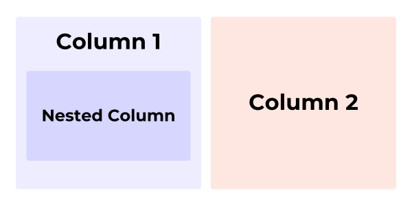
In simple terms, a nested column is a column inside another column.
It helps create structured layouts by dividing a column into smaller sections, allowing for better organization and design flexibility.
This approach helps create clean, responsive, and structured designs, making it a go-to method in modern web development.
Think of it like organizing a bookshelf:
- The main shelf (parent column) holds multiple sections (child columns).
- Each section can further be divided into smaller compartments, allowing for a neatly structured arrangement.

Nested columns are a way to organize content into smaller, more manageable parts.
Here’s how it works:
- Parent Column: Start by creating a main column, which we call the parent column. This is where everything begins.
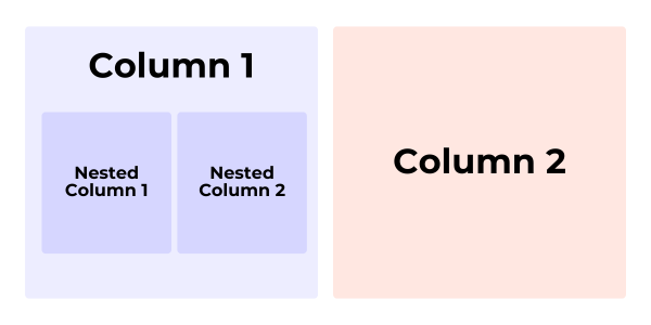
- Inner Columns: Inside the parent column, you can add a new row. This row can be divided into multiple smaller columns, known as inner or child columns.
- Flexibility: This setup allows you to control how your content is displayed. For example, in a single-column layout, you can create a two-column section, and each of those columns can have their own sections, too!
This method helps keep your layout organized and makes it easier to adjust for different screen sizes.
So, whether you’re on a phone or a computer, everything looks neat and tidy!
Why Use Nested Columns? (Key Benefits)
How to Use Nested Columns in Elementor (Step-by-Step Guide)
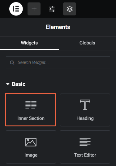
If you’re an Elementor nerd like me, you can easily create nested columns using the all new Nested Elements Feature or the Inner Section widget.
Elementor has both – Sections & Container as layout options & if you're using Sections over Containers, here's how to add a nested column using Elementor sections…
Step 1: Add the Inner Section Widget
- Open Elementor and add a Section.
- Drag & drop the Inner Section widget into the main column.
- By default, it creates two nested columns inside.
Step 2: Add More Nested Columns (If Needed)
- Right-click on a column > Add Column to create additional nested columns.
- Adjust column width, alignment, and spacing for a structured look.

Step 3: Customize & Make It Responsive
- Add text, images, or buttons inside the nested columns.
- Go to the Advanced Tab → Adjust padding & margins to prevent spacing issues.
- In the Responsive Settings, tweak the column stacking for mobile users.
How Nested Columns Work in CSS (For Developers)
If you're coding a website manually, you can use CSS Grid or Flexbox to create nested columns. CSS frameworks like Bootstrap also allow you to create nested columns manually.
Using CSS Grid
- When You Need a Complex Layout with Rows & Columns: If your design requires a parent grid that contains child grids (nested columns), CSS Grid is the best choice because it allows easy management of both dimensions.
- When You Need a Responsive Layout: CSS Grid allows you to make nested structures responsive easily by adjusting grid-template-columns based on screen size.
- When You Want Precise Control Over Alignment & Spacing: CSS Grid provides properties like align-items, justify-items, and gap, making it better than flexbox for creating structured nested columns.
CSS Grid is great for structured layouts:
.parent-column {
  display: grid;
  grid-template-columns: repeat(3, 1fr);
}
.nested-column {
  display: grid;
  grid-template-columns: repeat(2, 1fr);
}
Using Flexbox
- Flexible Column width: If you want child elements to align in a column while maintaining responsiveness.
- Working inside a flex container: If the parent element is already a flex container, you can set a nested container inside it as display: flex with flex-direction: column.
- Easy Alignment and Spacing: Flexbox makes it easier to center elements inside a column using align-items.
Flexbox is great for flexible alignment:
.parent-column {
  display: flex;
  justify-content: space-between;
}
.nested-column {
  flex: 1;
}
Which one should you use?
- CSS Grid → Best for structured layouts (pricing tables, grids).
- Flexbox → Best for flexible row-based layouts (buttons, menus).
Real-World Examples of Nested Columns
Example 1: Portfolio Website

A designer’s portfolio website projects uses Nested Columns, where primary column contains different project categories and then each primary column is further divided into another set of columns which displays project thumbnails, descriptions etc. This helps us to create a clean and professional presentation.
Example 2: E-commerce product Listings
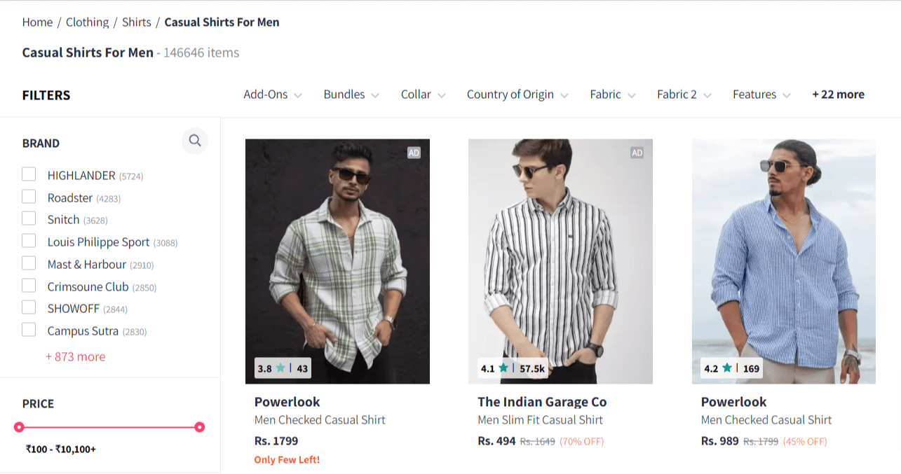
An online store uses Nested Columns, where a Main column contains multiple product categories inside that each categories there are another set of columns that displays each and every product with their images, prices, and descriptions.
Example 3: Email Layouts
An email layouts uses Nested Columns, wherein the main email body contains multiple sections, where each section may contain child columns to represent images, text and buttons.
Common Issues & Fixes
1. Columns Alignment Issue
Whenever you place a column inside a main another column that child column tries to take infinite height because columns doesn’t have any height constraints which creates a problem . Also, Child columns may inherit unwanted alignment property from their parent which may lead to layout distortions.
To fix this issue:
- We can use flexbox or grid in CSS for better alignment
- In Elementor, we can adjust padding and columns width to fix any type of layout issues
2. Nested Columns Adjustment Issues
Sometimes it may be possible that the layout is not able to adapt or adjust itself to different screen sizes and orientations. To fix this:
- Ensure that your CSS media queries handle different screen sizes.
- Reduce margin and padding inside Nested Column, check if the parent column has unnecessary padding which can affect your layout
- Use Bootstraps .col-12 for smaller screen to stack column properly as nesting can cause unexpected gaps.
3. Compatibility Issues
Not all databases support nested structures, some of the old browsers (especially iE11) do not fully support nested Flexbox and Grid properties. This problem can make migrations and integration tricky.
To fix this, simply test in multiple browsers to ensure consistency.
Conclusion – Should You Use Nested Columns?
Think of nested columns like a superpower – just use them right, and they’ll give your layout an unbeatable edge.
Overuse them, and they’ll turn your code into a tangled mess. The key is knowing when to wield them.
Nested columns can be a great asset when used smartly, allowing for complex and flexible layouts that enhance responsiveness and organization. They shine in designing multi-layered sections, such as dashboards, cards, or grids that require a structured hierarchy.
But beware- too much nesting can lead to increased code complexity, potential rendering issues, and performance drawbacks.
The secret?
Strike the right balance!
Use them when they add value, but keep things clean, simple-structured and purposeful.
So, why not put them to the test?
Try implementing nested columns in your next project and see the magic happen!