How to Design your WordPress Website Like a pro even if you’re a beginner
👋 Need help building or fixing an Elementor website?
I design fast, conversion-focused WordPress sites using Elementor.
So you have just created a WordPress website & now you are in the designing phase. Well, congratulations on that!
Because many folks just create a wp site, create some pages, put out some content & never consider the “design” part.
But you are awesome my friend because you thought of the designing part & maybe you feel like your website design can be improved.
That may be a reason you just did a google search on how to design a WordPress website, right?
Before I begin, here are three simple but very imp lessons for you right at the beginning.
- The first is, You’re not alone. To be honest, when I was starting out, I too was pretty confused & had no idea what to do & where to begin (more on this later)
- The second is, Design is Subjective. Be it graphic design or web design, it’s subjective. In simple words, you may not like my creation which is great in my eyes & vice versa. For example, Amazon is the biggest & trusted online store, most people hate its UI & UX.
- Last but not least is achieving modern website design with WordPress is possible. The reason I’m saying that is bcoz a lot of folks believe that WordPress is limited & you can’t create attractive designs which are not true.
For instance, you can navigate & take a look at my website (using header), it’s built on WordPress CMS using Kadence theme & Elementor page builder. I'm sure you'll like it.
So whether you’re a complete beginner or have some sort of knowledge about creating & managing WordPress websites, I can assure you that you can create a stunning website that not only looks good but also brings what matters most – profits.
In this guide, you’ll get to know the key areas to focus on, where to begin, some helpful tools & the step-by-step process of designing your WordPress website to make it look like a pro.
Are you ready? Let’s get into the details without much ado.
Step 1: Accomplish Modern Website Design using WordPress by Getting some Inspiration
Let’s be very honest. We, humans, are creative but not all of us at all times. It’s tough to come up with new ideas every now & then.
That’s why a better approach would be to get some Inspiration or in simple words, steal the ideas.
There’s a wise quote by Anthony J.D’Angelo
“Don’t reinvent the wheel, just realign it”
Anthony J.D’Angelo
Make sense? It should
Collecting Inspiration from various sources is a very common design practice that is followed by top professionals. So, why not me & you?
So, where to take inspiration from?
Well, there are plenty of them that might overwhelm you 😅
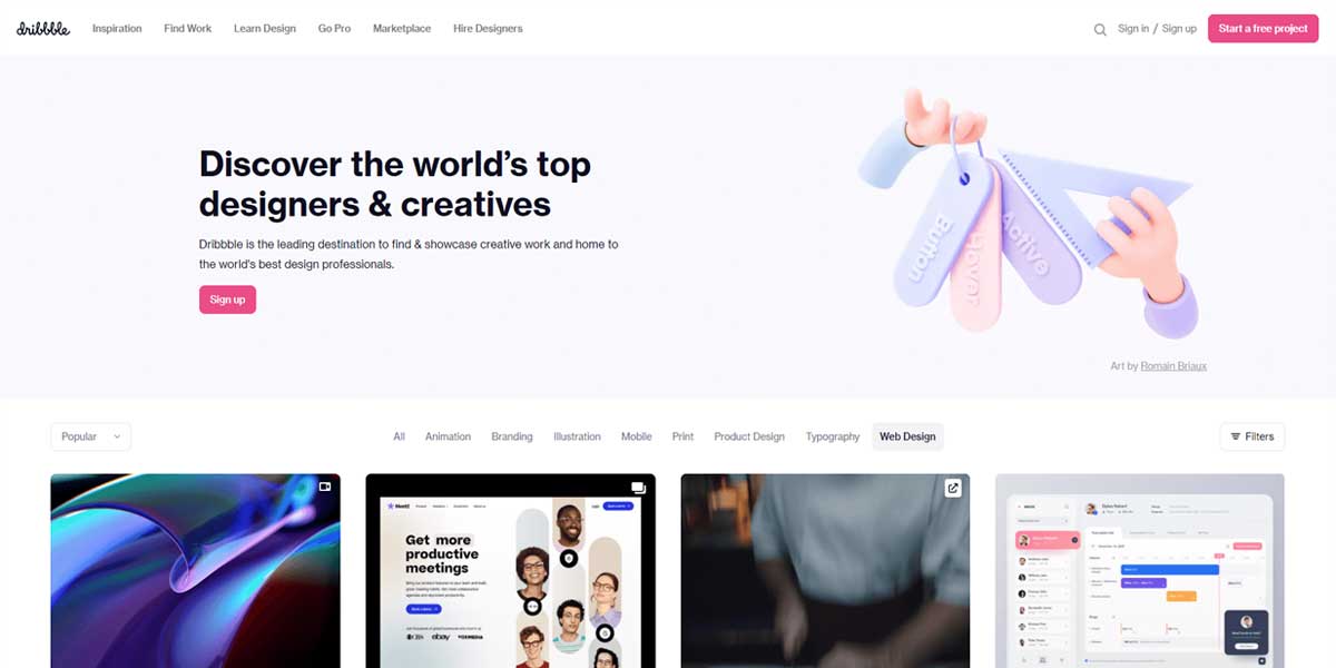
A good place, to begin with, is websites where designers live. Here are some of the most popular ones…
Another good source of inspiration can be your niche competitors. Yes, that’s true.
Simply visit your competitor's sites and note down or take a snapshot of all the things they are doing well in terms of design. Be it their navigation style or blog post layout, just take a snap of all the things you like & save it somewhere.
Quick Note: For taking snapshots on a chrome browser, you can use extensions like FireShot, LightShot, Awesome Screenshot, etc. These are simple, free yet powerful extensions that will boost your workflow.
Once you are done with the inspiration part, it’s time to get back into your WordPress dashboard and get a few powerful tools…
Step 2: Install the Right set of Tools on your WordPress website
If you want your site to stand out, you’ll need to pay attention to what you’re using on your site, otherwise, you may end up like “Just another WordPress website”.
When it comes to design, you have to look at your themes & plugins section as not all of them are design-friendly.
But here’s something really interesting…
There are over 8,000+ themes and 54,000+ plugins available in the WordPress directory.
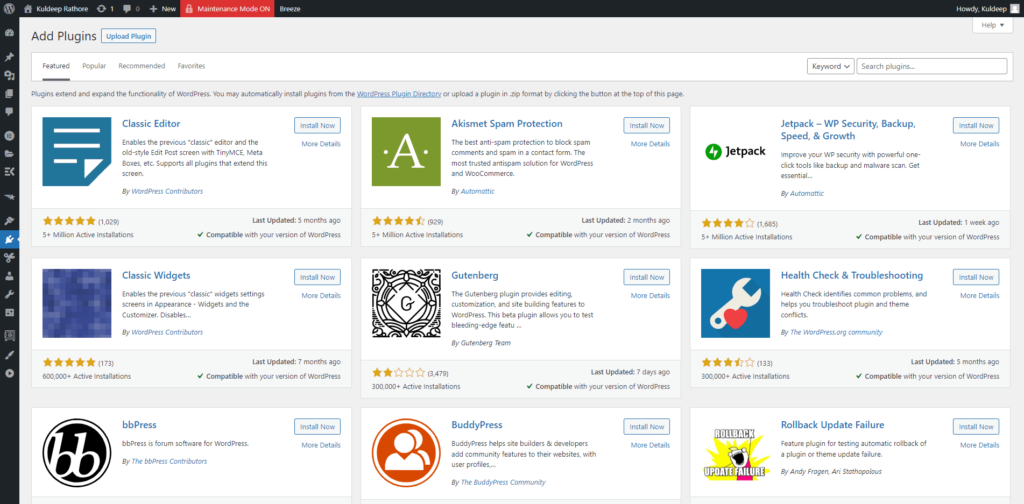
One can easily spend his entire life finding the best ones for certain use cases & I know you don’t want to be that one.
So, here are a few of my recommended themes that are pretty design-friendly…
Kadence Theme – The Only WordPress theme you’ll need to install
Kadence Theme is the #1 rated WordPress theme on the market for 2022. Most of my websites are built using the Kadence Pro version including this website.
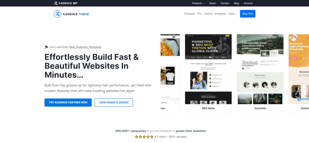
No matter what type of website you are creating, Kadence makes it simple & fast. Here’s why use Kadence over others…
- Both the free & paid version of the theme offers incredible ease of use and features that allow you to build any kind of website you want along with a lot of starter templates.
- Kadence Theme is even better than the Astra & Generatepress theme in terms of features & functionality (I've tried all of them & I can say that Kadence is light years ahead)
- The FREE version of the Kadence theme gives you much more options than most paid WordPress themes do.
- The theme is lightweight, feature-rich, SEO & design-friendly (I like that they offer color palettes & font pairings that provide consistent design throughout the website)
- Provides full control over the entire website & comes with an impressive header-footer builder (My website header is built using the Kadence header builder)
- Integrates well with most of the page builders. I use the Kadence theme with Elementor Pro & it works like a charm. You can navigate this website & experience both of them
Apart from features & benefits, I would also like to mention Ben Ritner. He's the founder of the theme & all KadenceWP products and has been very actively developing in the WordPress space for over a decade.
A Quick & Honest Note: Initially, I was more than happy to use what WordPress offers i.e a lot of FREE themes.
I quickly realized that FREE themes are not only limited but they are a little problematic & more importantly, getting support can be a pain in the ass.
I was with the free edition of Kadence but on 26th Nov 2021 i.e Black Friday, I decided to go for the pro version. Seriously, it’s one of my best investments. Just take a look at my Deals page & notice the color of the header (it changes to black).
I’ve simply used the Kadence conditional header feature that you get in the pro version. It's super awesome & now, it's my go-to theme.
Check out the Kadence pro version
If I had to choose between popular themes like Astra vs Kadence vs Generatepress vs OceanWP, then I would go with the Kadence theme every single damn time.
Kadence is my #1 recommended theme & I would love you to give it a try.
Design your site using the Drag & Drop functionality
How cool it is to design & build your site this way:
[presto_player id=2764]
Liked it? I'm using Elementor Page Builder.
It’s one of the favorites that I install on almost all of my WordPress sites. Also, it’s my most recommended tool for beginners.
I won’t go into detail, explaining its features & whatnot. Instead, I prefer summing up the info that’s easy to understand.
Here are the main benefits of using Elementor…
- It offers you an extremely easy-to-use drag-and-drop builder. You don't need to know HTML or CSS skills to design your website.
- Using Elementor you are not limited to a theme. You can make a custom header, footer, blog page & almost anything using Elementor.
- Comes with a simple & easy to use very beginner-friendly interface.
- Features such as Global Typogrably & Global Colors, etc help you create consistent design throughout your website
- Useful for almost every use case. Whether you're a blogger, marketer, web designer, small business owner, or an agency, using Elementor you can easily make your website look pro
- With over 90+ widgets and 300+ Basic & Pro Templates, you can build your sites crazy fast.
- They also offer a FREE version but I highly recommend using the Pro version for creating popups, headers, custom post types, contact forms & much more.
- As it's so popular, you can easily find a ton of tutorials on youtube
- I’ve said many times that there's a business model behind it which gives me mental peace that elementor is not going anywhere shortly. They have a solid team & a really helpful community. To be honest, I've seen a constant improvement in Elementor since 2019 & because of that I trust the company & love using its product.
If you want to see Elementor in action then you can check out some of my web pages & they are
Quick Note: Their Free version is limited. I recommend using the pro version as the global styling comes in the pro version. Also, most professionals use Elementor Pro for designing their websites.
You can Get Elementor Pro here
Once you get the required tools & plugins, the first thing to do is understand & set a website layout.
Step 3: Understand Layouts to create more professional websites
I’m sure most of you are familiar with Gmail, Google Docs as well as Google blog.
Quick note: To help you understand better, I’ve used images, so a small request not to ignore them.
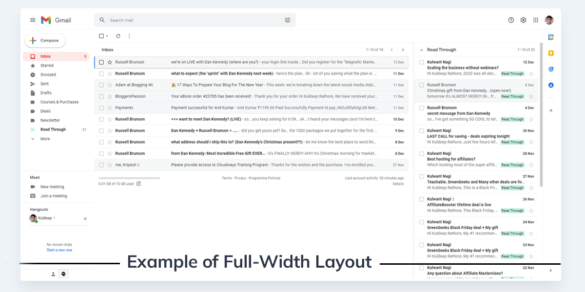
Take a look at the Gmail Interface…
Now, take a look at this blog post on blog.google.com
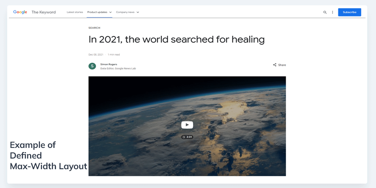
Can you spot the difference? Let me make it simple for you.
Gmail has a full-width layout while the blog has a narrow layout. Why so?
The answer is pretty simple “for the best user experience”
In general, blogs & most other websites should set a max width & a narrow layout. For Saas-based & eCommerce websites, feel free to use a full-width layout for the best user experience.
Need more examples & explanations? Take a look at Neil Patel’s blog post layout…
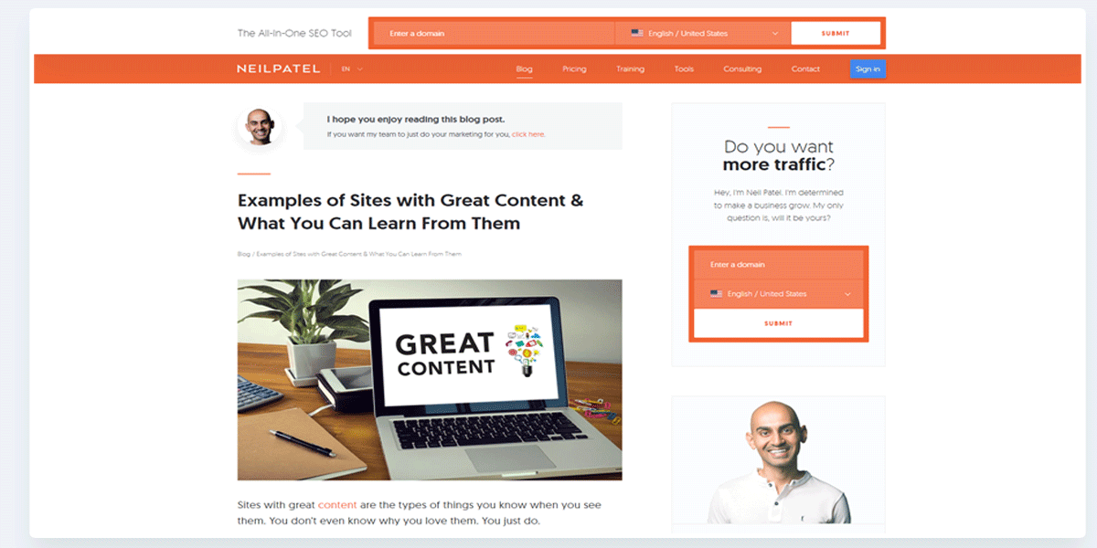
Notice how all the content of the site is aligned within a box. Here, the content layout is set to max width1200 px. Meaning, that no matter the screen size, the content will stay in a box that is already defined.
Now, take a look at Neil Patel’s popular SEO tool called Ubersuggest…
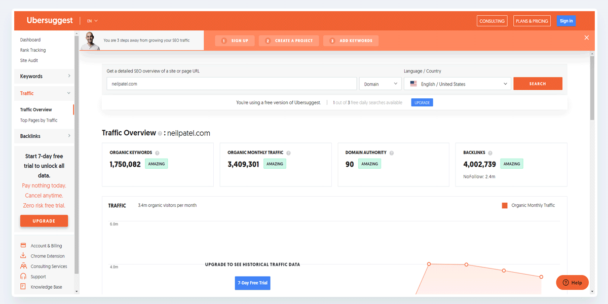
Notice how all the content is not within a box. Here, the content layout is set to full width.
Meaning, that the website will adjust its width according to your screen size. No matter whether you are viewing it from a 1920×1080 monitor or 1366×768 (most laptops)
I hope now you got some clarity.
Now here’s how you can get it done right on your WordPress website…
For this guide, I’m using the Kadence theme but most of the themes have this option so you can follow along…
Step 1: Once you are right inside of your WordPress dashboard, hover over appearance & then click on Customize. This will open the Customizer.

Step 2: From a long list of options, go to the General tab > Layout option. Once you're here, the settings panel looks somewhat like this…
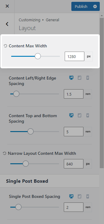
Using the very first option, you can set a max width for your WordPress website.
I use 1280px which is a standard layout. You can set anything here but don’t be too creative. Set some logical & standard layouts.
For content max-width, you can use:
- 1140 px
- 1200 px
- 1280 px (standard)
- 1400 px
- 1920 px
Please note: Don’t use random numbers, especially odd numbers. I won’t recommend experimenting with layouts.
Key Takeaways: For most cases, a max-width layout of 1280px will be a great choice. For saas & products-based sites, using full-width can be a good option.
Step 4: Create a Simple Design System inside WordPress
One of the best things that you can do to make your website look professional is to create a simple design system for your website.
Design System is itself a huge topic that I won’t recommend you to get into unless you want to be a web designer just because it takes years to learn & master.
For now, just know that the Design System is a guideline for the usage of typography & colors. The goal of creating and using a design system is basically to be consistent throughout our website.
There’s a general rule in website designing & i.e:
- Never use more than 2-3 fonts on your entire website
- Create a color palette & stick to it
For example, take a look at my website.
For headings, I only use Montserrat & for body content, I use Mulish font. That’s it. For colors, I use orange as my primary color. So far, you’ve experienced how & where I use it 😉
Creating an effective design system isn’t possible with all WordPress themes & page builders. Take a look at Elementor's design system settings…
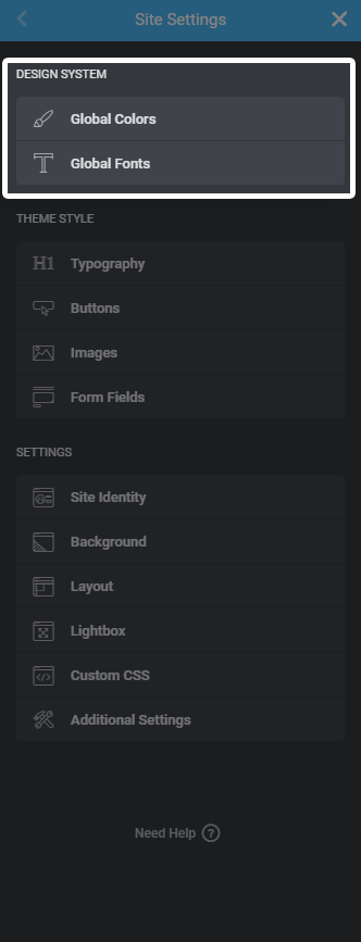
And that’s the reason I mentioned Kadence and Elementor above. Both Kadence theme & Elementor Pro allows you to set global values for colors, typography, headings, links, and so on & so forth.
For your reference, I’m linking to the original guides that you can follow:
If you need a video guide for setting Global styles inside Elementor, then I highly recommend checking out this tutorial created by a web designer Jeffery whom I admire.
Quick Note: Global Styling is only available in the Pro version of Elementor. You can Get Elementor Pro here so that you can set global styles for your website.
Step 5: Don’t Ignore the Negative Spacing
On average, I go through about 3-5 new websites every day. Some are pretty awesome & some I bounce off right away. One of the key reasons that some websites look unattractive is bcoz they ignore the negative spacing.
So what is negative spacing?
Negative space, also known as “white space” simply means the unused area on a webpage.
According to speckyboy, Anything that doesn’t catch the user’s attention on the page is negative space. This doesn’t mean the space should be necessarily white: it can be any color, an image, or any other background.
Need some examples? Here we go…
For a better explanation, I’m using my website 😉
Take a look at my WordPress Hosting page:
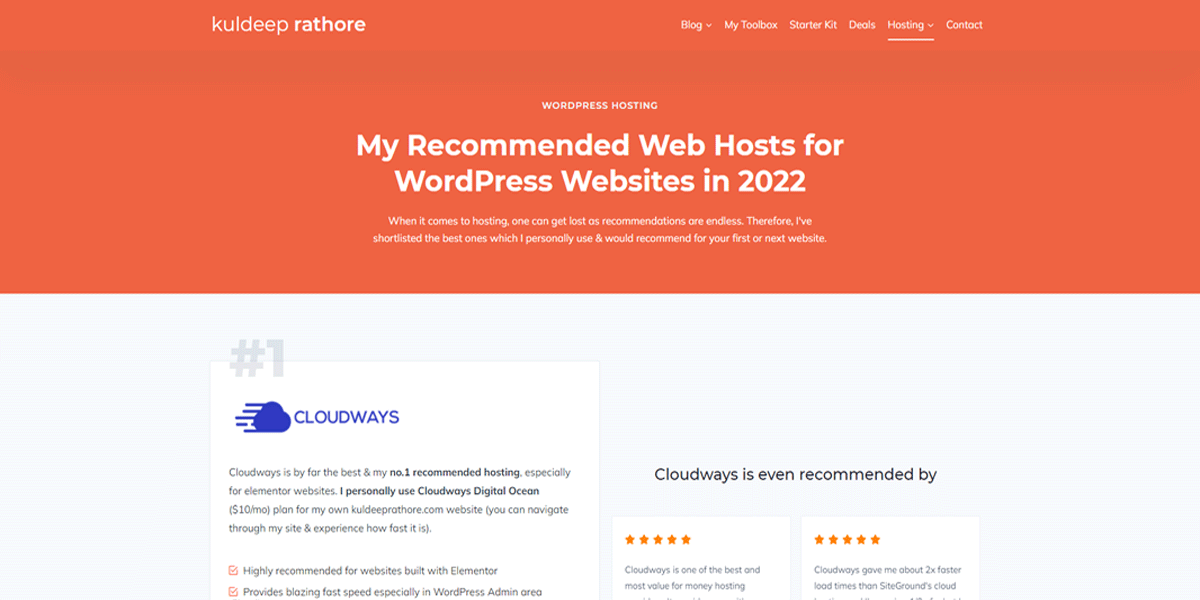
Now, when I reduce the spacing, my WordPress hosting page would look like this:
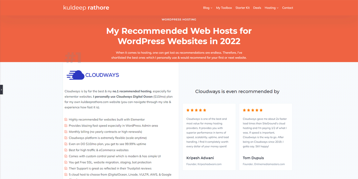
Can you spot the difference? The second one without spacing looks bad & unattractive.
You see, using negative space not only makes our design look good but also makes our content readable.
Also, make sure to be consistent here as well. Meaning, that if you have given 80px padding at the top of the section then (in most cases) you should give 80px padding at the bottom as well.
Key Takeaways: Negative space when used correctly focuses user attention and creates a meaningful visual hierarchy. Also, the use of space makes it easy & comfortable for a user to explore.
Step 6: Simplify your Header Navigation
Your website header is one of the key focus areas & you should pay attention to it.
All you need to do is simplify it. Meaning, cut out all the unnecessary menu links that have no business value.
A good thumb rule is to keep your primary header links between five to eight. It provides a better user experience & pretty easy to go through even for those in a hurry.
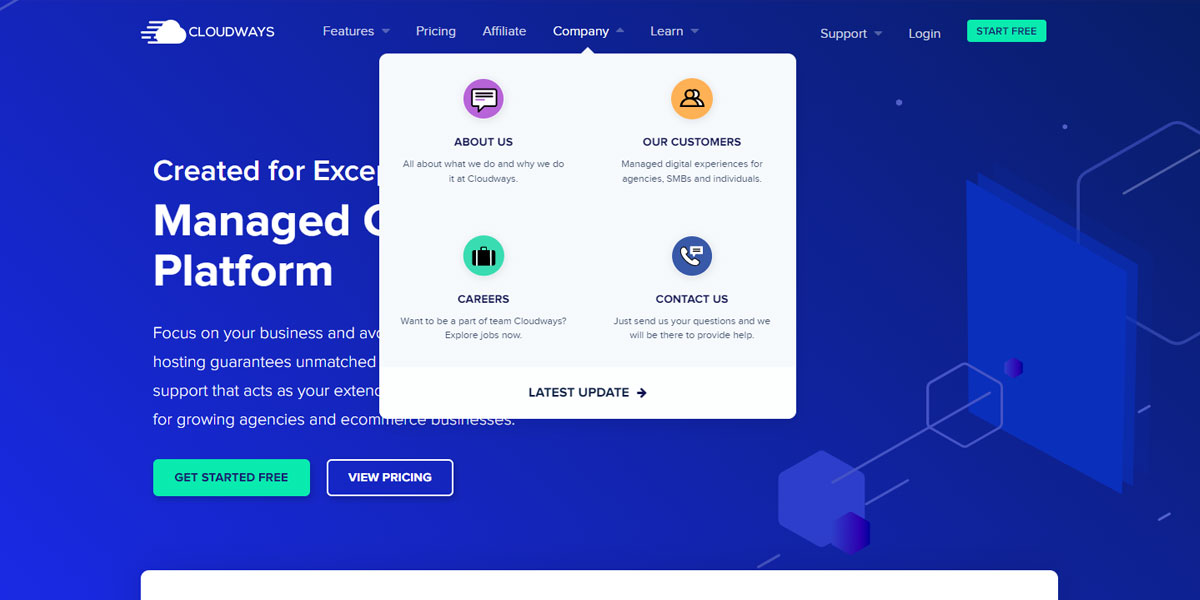
If you think you need more than 8 elements/page links within your header navigation, then it’s better to use a dropdown menu.
Example of navigation with dropdown menu…
Simplifying your header as well as making your permalinks human-friendly won’t take much time (up next)
I suggest you log in to your WordPress dashboard & get it done today.
Step 7: Enhance your Permalinks & Make them Human-Friendly
Often beginners ask me which hosting should I purchase, what themes & plugins shall I use & many more questions.
To solve their problem, I’ve mentioned all of my recommended themes & plugins on my Starter Kit page that is worth checking.
Here’s the URL of my starter kit page- https://kuldeeprathore.com/?p=7268929 (this page doesn’t exist)
I won’t be surprised if you felt it is spammy. That’s what your users may think when your permalinks are not so readable.
The actual URL of my starter kit page is this – https://kuldeeprathore.com/starter-kit/
It's not only readable but rememberable as well. That’s exactly what you should do.
Log in to your WordPress dashboard & then go to permalinks settings which can be found under Settings > Permalinks.
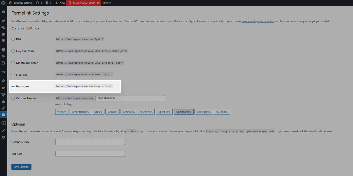
From here, simply select the post name and click on save changes.
When you use the “post name” settings, the URL structure is the sanitized version of your post heading/title.
For instance, on my tools page, I’ve set the title as – “Tools I Use to drive my business”
& for this page, the default URL structure became (https://kuldeeprathore.com/tools-i-use-to-drive-my-business), which again is not so easy to remember.
That's why I’ve skimmed the link to make it more friendly. My actual URL of the tools page is https://kuldeeprathore.com/tools/ (You can check what tools I use & recommend)
This simple setting can enhance your site because using simple URLs is also good for SEO.
Step 8: Make sure your design gets more Eyeballs – Speed it Up
#1 – Choose a Reliable & Super Fast Host
Once you’re done with creating a design system, implementing negative spacing, simplifying your header navigation & making your permalinks readable, the next step is to reach more eyeballs.
There’s no point in designing a website that is not useable & doesn’t load fast. What I mean by this is to speed up your WordPress website.
Because fast websites are not only important for Google rankings but also equally important for the user experience.
You’ve to make sure your awesomely designed website is accessible in seconds, not minutes.
When it comes to speed, Hosting is the #1 factor & caching (more on this later) is second, and out of all hosts, I highly recommend Cloudways Hosting especially if you’re using or going to use Elementor on your WordPress website.
Most likely, you already have a hosting account & have already done with the setup.
Then too, if you feel it’s a bit slow & not as fast as it should be, especially in 2022, I have a piece of good news for you.
You don’t need to change nameservers, migrate and do all the headaches now.
For now, simply Signup on Cloudways (It’s FREE for 3 days & No Credit Card is Required)
I’m saying that bcoz with Cloudways, you get a temporary website that you can test for 3 days at no cost. Install Elementor & other plugins & just check out the speed. I’m sure you’ll be blown away as it’s crazy fast.
Once happy, you can simply ask for a migration. They do offer one Free migration.
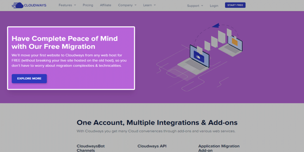
Click here to start your 3-Day FREE Trial
Disclosure: This website is also hosted on Cloudways (Digital Ocean $12/mo plan). I don’t just promote random stuff. My recommendations are based on my experience and knowledge of these companies and their products, and I recommend them because they are genuinely helpful and useful.
Know that I only recommend products and services I’ve personally used and stand behind. You can read my full disclosure here.
#2 – Cache your Site for more speed
In case you need a little explanation…
Caching refers to the process of creating static versions of your website content, storing it in the browser, and then serving that to visitors. Static pages are usually rendered quickly in browsers. This leads to faster performance of your website.
The caching plugin makes a copy of the page after the first load & then serves that cached version to your visitors.
When you use a caching plugin, it reduces the load on your Hosting server & makes your website run faster. That being said, there are many caching plugins like LiteSpeed Cache, Breeze, WP Fastest Cache & so on.
But the one I use & recommend is WP-Rocket (it’s a premium plugin, starts at $49/yr)
WP-Rocket is by far the best caching plugin for WordPress websites.
It’s pretty easy to use & unlike other caching plugins, it doesn’t require much configuration. A few simple tweaks & boom!
Step 9: Be Fearless & Let your Creativity flow
While developing & designing your WordPress website, you might want your blog post layout or header navigation to look different than the standard ones.
Well, my friend, be fearless & design the way you want because ultimately, it’s your website.
Although I won’t recommend going crazy & coming up with something weird. It’s better to get inspiration & then with your creativity, give a different look.
I experiment a lot with layouts & colors when I’m in a flow 😅
Forget about what they’ll say & how they’ll perceive. For you to be the best at your work, let go of all your worries about others & design however you like.
With this, we come to the final point.
Step 10: Test! Test! Test!
Even the top professionals can’t guarantee you that a certain design will work out for you.
That’s why just test out the layouts, design, call to action, etc & continue doing it until you find what works & what does not.
You can use Web Analytics & AB-testing tools like
Again, be fearless & keep analyzing & keep testing.
Also Read: How can Businesses benefit from using Analytics on their website
Chances are that just by changing your button color, or button size, you get more signups to your email list. There’s an amazing case study on Call-to-action by Yuvraj Pratap which you can read here.
A Few WordPress Design Tips
Let’s be honest – we all like tips & tricks!
My 10-step guide on “How to design a WordPress website” is great for beginners & along with that, here are a few tips that I think might be useful for every WordPress user.
#TIP 1 – Your Competitors are your best friends: Go and analyze 3-5 of your competitor's websites & note down what they are doing good & then improvise & implement it on your website.
#TIP 2 – Harness the Power of Premium Tools: Get Kadence theme & Elementor Pro & build your website on the fly. I use Kadence with Elementor & the combination of both works like a charm.
#TIP 3 – Make your website cleaner by using Negative Spacing: Add some (equal) spacing between elements, and sections & see how your design improves drastically.
#TIP 4 – Use Proven Font Pairings: Go to fontpair.co, select the pairing you like & then implement the same on your website. A general thumb rule is to use fewer than 3 fonts on your entire website.
#TIP 5 – Optimize your Website Layouts: If you have a blog or business site, set your website max-width layout to 1280px and make sure all the content is aligned inside the 1280px box container. If you’ve got a saas or product-based site, you can make your site full-width.
#TIP 6 – Create a Simple Design System: Set Global Typography and Global Colors for your website & then stick to your color palette. Avoid using too many colors. You can use Elementor Pro for achieving this on your WordPress website.
#TIP 7 – Use Child themes for a custom design: No matter which theme you’re using, avoid modifying the default theme. Instead, make all your desired changes using a child theme. Premium themes such as Kadence provides a child theme for easy customization.
#TIP 8 – Speed is as important as your Design: Make sure to use a good hosting service & use a proper caching mechanism so that your website loads super fast. I use Cloudways Hosting along with the WP-rocket caching plugin.
#TIP 9 – Focus where your users are landing: If your website is already receiving traffic then simply go to your analytics & see which pages/posts are most visited & then see if something can be improved on those particular pages. You can use privacy-friendly analytics tools like Fathom Analytics.
#TIP 10 – Do not hide Call to Action: Make sure your Call to action(CTA) on each & every page stands out & grabs user attention. If you want people to get in touch with you, then a CTA leading to the “Contact page” should be in your website header.
#TIP 11 – Be Patient & Keep Browsing: Your website isn’t shutting down tomorrow. So, please have little patience & take some time to browse a lot of real-world sites. You'll get a lot of surprises.
I hope these tips will help you to design your WordPress website better.
Final Words on Website Design using WordPress CMS
Designing a website on WordPress is a lot of fun but it requires patience, learning, and implementation.
Doesn’t matter if you come across 40+ WordPress Design Tips or just a few (the ones listed above), all that matters is the execution of the tips you’ve learned.
So don’t just browse websites one after the other, instead log in to your WordPress website & start implementing whatever you found useful.
Lastly, please note that this is not a YouTube video that I cannot update. It’s a blog post that I regularly update with new tips & tricks.
Did I miss any tips that might be useful for other WordPress creators?
Do let me know in the comments. Also, if you found this post useful, share buttons are right below & I know you're good at hitting them 😉

About the Author
Kuldeep Rathore is a WordPress & Elementor expert and co-founder of 60Pixel. With 3+ years of hands-on experience, he builds fast, SEO-optimized websites for creators and small businesses. Through this blog, he shares practical tutorials and tips trusted by the WordPress community worldwide.

Its like you learn my thoughts! You seem to know so much approximately this, such as you wrote the
guide in it or something. I feel that you could do with a few p.c.
to pressure the message home a bit, but instead of that, that is wonderful blog.
A fantastic read. I’ll definitely be back.
Thank you so much for your kind words, it means a lot to me.
Wishing you the best of luck with your business this new year.
Cheers,
Kuldeep